On each of these publications, I directed the look of the piece, including colors, typefaces and graphics. I also laid out the pages, and in some cases, wrote or edited the copy.
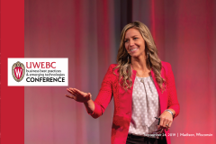
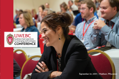
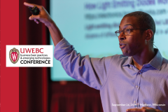
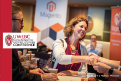
[2019 annual conference program covers]
Because our conference was using the Guidebook app, we did not need the full-blown programs of years past. To save space, paper and money, we decided to decrease the page count and size of our conference handbook.
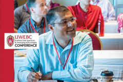
With a cover that was half the size of the traditional publication, I was not able to easily use a collage or mosaic of photos. However, we did not have one image that told the whole story of the conference.
Working with UW’s print shop wizards, I created a variable cover. The conference programs were covered in one of four different designs that each showed a different facet of the experience. Due to the full-page bleed, I was able to highlight the strong emotions and action in the images made by Andy Manis.
[executive summary for oregon client]
This was a recent project that I spent about a full day on. The project manager came to me in a pinch, and luckily, a lull in deadlines meant I could tackle this fun piece. The client is associated with the state government of Oregon, and the brochure was actually an executive summary of a statewide economic study, so I knew I wanted to feature something Oregon-centric. I wasn’t overly inspired by the agency’s logo, so I took a look at the websites of airports across the state.
Most of the airports (and the agency’s logo) used blues and/or greens, so I knew I wanted to stick with that color scheme. I was hoping to use a teal or peacock blue, because I think it’s an interesting color that is still on-trend but not too risky for a public client. While browsing my files and the Internet for inspiration, I realized the outline of the north border of Oregon looks a bit like mountains when blown up. I did some informal testing (asking friends and coworkers!), and they saw the same thing. I thought this callback to the state’s natural resources would be a great way to incorporate a graphic without being too busy (a requirement for the client’s staff). The brochure turned out to be a great blend of modern and traditional.
[master plan executive summary]
On this executive summary, I wanted something clean and fairly modern, but not too crazy. The project manager requested the horizontal format, which led me to strong horizontal photos and infographics. I was able to use the blocks of transparency throughout to pull the eye to the right, as well.
[mountain airport executive summary]
This client is a small airport on the border of Idaho and Washington. With many stakeholders (two states, two cities, two counties and two universities!), it was imperative that this design work for many different people. To make things more interesting, this piece had to fit with a previous summary designed by someone else. I took the horizontal stripes from the original piece, incorporated the client’s logo colors and drew a diagonal eyeline to add a bit of interest (and also helped solve a problem with the tricky runway photo)!
[yearbook newsletters]
When I worked as a yearbook representative, I created my own newsletters for my clients and prospects. I designed the template, wrote the content and published the newsletter in print and digitally.

